Cost Dashboard
Last updated on
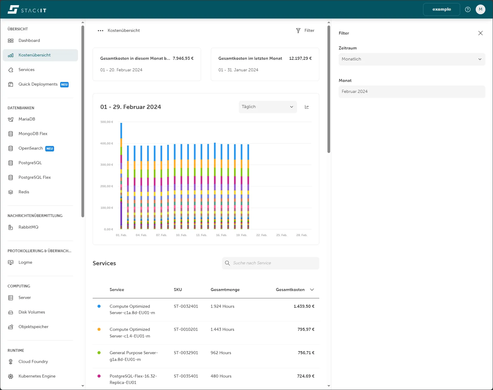
The Cost Dashboard gives you an overview of the costs for your project. This is a free product available as soon as you create a project.
You can filter the costs by time period or month. Costs are displayed by month by default.
The dashboard shows the total costs for the current and previous month, a chart, and a list of all SKUs and their total costs.
The Cost Dashboard provides no cost data for the current day.
The previous day’s cost data is available after 7:30 UTC.
Access and permissions
Section titled “Access and permissions”You find the Cost Dashboard in the side navigation. If the permission cost-management.billing.get is assigned to your role, you can view the project’s costs.
Roles can be assigned to users on project level and on customer account level. To do so you need to open from the side navigation IAM and Management and then Access. You need to assign one of the following roles to access the cost and billing related data:
| Access level | Role |
|---|---|
| Project | Editor (General Roles) |
| Project | Owner (General Roles) |
| Project | Cost Management Cost Reader (Product Roles) |
| Customer Account | Owner (General Roles) |
| Customer Account | Cost Management Cost Reader (Product Roles) |
The product role Cost Management Cost Reader gives you the advantage that a someone with read only permissions can access cost management features, without being able to make changes to resources like an owner or editor can do.
Projects without any costs for the selected period show the message “No data available.” If there is usage without cost, this usage appears in the table below the dashboard.
The time range selected for visualizing cost and usage data is always in UTC, not your local time zone.
Example: Selection for February 2024
- Start = 2024-02-01 (Inclusive start date of the selection range. Internally, usage is recorded in UTC. All usage starting on or after 00:00:00 UTC on this date is included.)
- End = 2024-02-29 (Inclusive end date of the selection range. Internally, usage is recorded in UTC. All usage up to and including 23:59:59 UTC on this date is included.)
Filter costs
Section titled “Filter costs”The Filter button in the top right shows or hides filter options. When you select a time period, more filter parameters appear.
| Period | Description | Filter parameters |
|---|---|---|
| Monthly | Cost data for a full month. | Select a previous or current month within a chosen year. |
| Quarter | Cost data for a quarter of the year. | Select Quarter 1–4 of a specific year or the current partial quarter. |
| Half-yearly | Cost data for the first or second half of the year. | Select the first or last six months of a year. |
| Yearly | Cost data for a full year. | Select the current year or a past year. |
| User-defined | Cost data for a specific period. | From: Select a start date. To: Select an end date. |
By default, the Cost Dashboard filters costs by the current month. The filter settings show a monthly period with the current month preselected.
View total costs
Section titled “View total costs”The two tiles at the top of the cost overview show the total costs. These totals are not affected by the filter settings.
The left tile shows the total costs for the current month from the first day to the previous day. The time period is shown at the bottom of the tile. The right tile shows the total costs for the last month. Both tiles are structured the same way so you can compare your costs easily.
Chart of costs
Section titled “Chart of costs”The chart below the total cost tiles shows a visual representation of your total costs. This chart is linked to the SKU list below it and updates based on your filter settings.
The x-axis shows the time points for the selected period. For example, if you select February 2024, the x-axis shows each day from 1 February 2024 to 29 February 2024. Total costs in euros are shown on the y-axis. Past time periods that generated costs are shown as columns. You can read the total costs per time period using the faint horizontal grid lines. Each SKU is a color assigned.
When you move the mouse over a colored bar in that chart, a small info box appears showing the date, the SKU name, and its accumulated costs.
Change the chart appearance
Section titled “Change the chart appearance”The top-right corner of the chart has a selection box and a button. The button (Line chart icon) lets you switch between a bar chart and a line chart. The icon changes to a Bar chart icon after switching. The selection box values depend on the filter settings and let you group multiple time points. By default, the first value for each time period filter is selected.
| Period | Value in selection box | Description |
|---|---|---|
| Monthly | Daily | One point in time on the x-axis corresponds to one day. |
| Weekly | One point in time on the x-axis corresponds to one week and therefore adds up to seven days from Monday to Sunday. Note: This summation may include points in time outside the period. Example: February 2024 started on a Thursday, which means that the Monday, Tuesday, and Wednesday from the previous month are also retrieved for the total. | |
| Quarter | Daily | One point in time on the x-axis corresponds to one day. |
| Weekly | One point in time on the x-axis corresponds to one week and therefore adds up seven days from Monday to Sunday. Note: This summation may include points in time outside the period. Example: Quarter 4 in 2023 started on a Sunday, which means that Monday, Tuesday, Wednesday, Thursday, Friday, and Saturday from the last quarter are also retrieved for the total. | |
| Monthly | One point in time on the x-axis corresponds to one month. | |
| Half-yearly | Weekly | One point in time on the x-axis corresponds to one week and therefore adds up seven days from Monday to Sunday. Note: With this summation, times outside the period may be included. |
| Monthly | One point in time on the x-axis corresponds to one month. | |
| Year | Weekly | One point in time on the x-axis corresponds to a week and therefore adds up to seven days from Monday to Sunday. Note: With this summation, it is possible that times outside the period are included. |
| Monthly | One point in time on the x-axis corresponds to one month. | |
| User-defined | Daily | One point in time on the x-axis corresponds to one day. |
| Weekly | One point in time on the x-axis corresponds to one week and therefore adds up seven days from Monday to Sunday. Note: This summation may include points in time outside the period. Example: Quarter 4 in 2023 started on a Sunday, which means that Monday, Tuesday, Wednesday, Thursday, Friday, and Saturday from the last quarter are also retrieved for the total. | |
| Monthly | One point in time on the x-axis corresponds to one month. |
View the list of SKUs
Section titled “View the list of SKUs”The list below the chart shows every SKU that incurred costs for the selected project within the specified period. The list includes the SKU name and item number, the total quantity consumed, and the total costs for each SKU. The colored circle next to each SKU corresponds to the color used in the chart. Hovering over a list item highlights the corresponding SKU in the chart.
Sorting and filtering
Section titled “Sorting and filtering”By default, the list is sorted by total costs. You can also sort by SKU name, SKU item number, or total quantity consumed by clicking a column heading. Clicking the same column heading again reverses the sort order. You can filter the list using the free-text search field to find a specific SKU name.
Cost API
Section titled “Cost API”You can also access the data from the Cost Dashboard by using the Cost API. You can find the API specification in the API Explorer.
Data availability
Section titled “Data availability”The previous day’s cost data is available after 7:30 UTC. The Cost API provides no cost data for the current day.
Please note that data from the Cost API can be subject to change throughout the month. For the most accurate and complete historical information, we recommend you always request data from the first day of the month up to the day prior.
Time zones
Section titled “Time zones”The time range selected for visualising cost and usage data is always in UTC, not your local time zone.